X
X Social Media redesigning post composer with minimalistic UI

X social media is working on a new version of its post composer and the new UI is likely to free up some space to make it look clean. Input coming from X tipster, Nima Owji shared the details that X is working on a redesigned post composer with stripped UI components.
The shared screenshot shows that the new post composer brings an organized layout. The composer has an outline, which concentrates users of the click space to initiate writing.

Image source – Nima Owji – X/Twitter
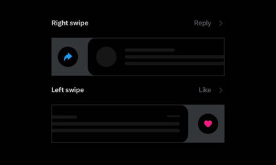
On the right side of the text space, you will see media, GIF, and poll icons. Above the composer, there are two tabs “For you” and “Following” followed by trending, bookmark, and latest icons. It also seems that the top bar also supports right-to-left swipe gestures.
Overall, it’s a much more simple and modernized look as compared to the current one. For now, this redesigned post composer is currently under development and may be released soon for all of the X users.
(source)


